
Get hungry.
Creating a one-stop meal-prep portal
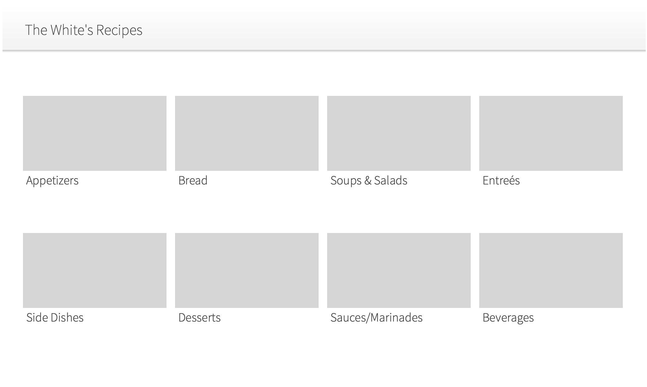
Overview
When you're a DIYer, know how to build websites, and can't find the ideal meal planning, prep, and shopping tool for your family, this is the result. I created a portal to store and share our recipes with an easy way for my wife to add and update content. This evolved into a full-feature web app with three distinct sections: Recipes, Meal Calendar, and Shopping Lists.
Challenge
Creating an interconnected web app that 'just works' is no easy task. It needs to look good, be intuitive, have a slew of features, and, as it became more popular with friends and family, support multiple users.
My role
Husband of the client
- Web design
- Web development
- UX/UI design
This is an ever-evolving project. The intro and first few iterations are on the first page. The current state is shown on the second page.
Research
The current state of recipe websites.
Whenever I'm presented with a task, the first thing I like to do is look for similar offerings in the wild. Is there something that has something similar to functionality I need? Has a design challenge been solved already? I researched top recipe websites to see what they've been doing. I found some glaring issues.
It's often hard to modify, store, and share recipes.
The workflow I kept hearing from various home cooks was:
- Find a recipe on one of the major food sites.
- Pin that page to Pinterest.
- Plan when to have that meal.
- Create a shopping list from the recipe's ingredients.
- Go shopping, get everything needed, wait for the start of meal prep.
- Find that recipe in Pinterest, open it, scroll to the actual recipe, and start the actual meal prep.
- Scroll up to the ingredients, scroll down to the step, switch apps to the unit converter, switch apps to the timer, ...
Almost every step in the process requires a different tool. Nothing is truly connected to work together.
Recipes aren't interactive.
Do you end up using your phone as a timer, unit converter, and web browser? Current recipe sites don't incorporate features that make this process less frustrating. The result is losing your place in a list and having to read through it again.
Here's my life story.
Almost all recipe websites start with a story about the author's experiences with the dish. I believe the purpose is twofold: to connect the recipe to an emotion (to make it more memorable) and to increase search engine ranking. The latter is understandable. The former almost always fails. Users want to get to the ingredients and the instructions without having to scroll halfway down the page.
Define
Home cooked meals made easier.
The target audience and personas seemed pretty obvious to me, but I still wanted to go through the process and do things right.
The busy home cook.
Meal prep takes time. In a busy household, the chef of the family shouldn't need to search for the right tools or do the manual process of transferring items between separate tools.
The persona is based on my wife: A millennial, working mother of two. She wants something easy to use - something that makes her life easier. She enjoys trying and sharing new recipes, but not when it adds too much extra time to her already busy lifestyle.
Ideate/Test
Wireframes, failures, iterations, and designs.
Recipes
I realized pretty quickly that I was building something more for me than for my wife. My first iteration required some basic HTML knowledge in order to update a recipe - of which my wife has none. It was also too bright - more often than not meal planning happens at night. Hello, dark mode!
The first version was admittedly pretty bare bones.
From there I realized I had planned to make things too 'showy'. I had massive image blocks and a low density of information without an intuitive search method.
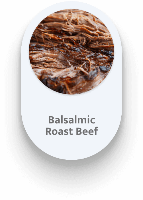
I also knew that while information density is important, so is an appetizing picture. 'You eat with your eyes first.' I went through multiple design iterations to find a balance of information density, attractive content, and intuitive UI.


I found the most intuitive way to create and update content was to do as much of the work in-line as possible. So the interface for recipe creating/editing looks very similar to the way the final recipe will look.

You see what the recipe will look like as you go.
When the recipe is created, it automatically wraps each new line into a new list item, so it's easy to copy and paste from other sources. I also used this feature to create the ability to check off ingredients and steps as you go - No more losing your place!

The final result.
Meal planning
Okay, the recipes have been added. Now what?
You can search for recipes on the main list with live updating as you type. But that doesn't help if you want to create a calendar. My family plans our meals two weeks at a time. This cuts down on shopping and helps to reduce the decision paralysis of 'what are we having for dinner?'.
So I did just that – I created a calendar that autogenerates two weeks forwards. I pulled the recipe list into a frame next to the calendar and made a drag and drop interface to easily plan meals. I also added the ability to create 'fake' recipes – things not in the recipe list – and add a URL to link to an outside source if needed. We often use this for 'getting dinner out' or trying a new recipe before deciding if we should add it to the main list.

The wireframe

The mockup
My wife was thrilled with the calendar's capabilities, but she asked for a meal history going back two weeks as well. She wanted to see what we'd recently had to avoid too much repetition.

Shopping List
There are tons of shopping list apps out there. I knew mine would only be useful if it was directly integrated with everything else. I achieved this by pulling information directly from the calendar and recipe list. When the user adds a recipe to their meal calendar, the recipe is accessed, its ingredients are copied, and an 'upcoming recipes' section is added to the shopping list with those ingredients. The user can then check that list against their pantry and modify it as needed by either deleting items or adding them to individual stores' lists.

The first version sorted everything by stores, but it wasn't clear how to add new items.

The next version started with an expanded store to show the items and a button to add new items.

It was still pretty clunky.

Then I tried grouping similar UI content together - filters and stores at the top, items at the bottom.

It was intuitive to use, but it still took too much screen space. Mobile use required a lot of scrolling.

And of course I included various sorting and content options. New items can be created. Items include a name, quantity, brand, store, and section/department. These are then sorted by status, store, and then section, alphabetically.

Based on feedback, I added two more features. First, I added a way to bulk delete items from a store list that had already been added to the cart (purchased). Second, I added a new status: save for later. This allowed us to see at a glance that we're running low on an item, but we don't need it right away – very useful when waiting for sales.
Evolve
Keep testing, keep iterating.
Remember when I said this was a constantly evolving project? Even though this is a hobby, it's a tool my family (and a growing list of others) uses on a daily basis. As technology, trends, and more usage data keeps changing, I like to revisit it to look for ways it can be improve.
This should have been mobile-first from the start.
The vast majority of people don't sit down at a desktop computer to meal plan. It doesn't make sense to have this be a desktop-first, mobile-second web app. I redesigned this from the ground up to be way more mobile-friendly, and I added in a ton of requested features along the way. While I was at it? It was time for a design refresh.

This is an ever-evolving project. The intro and first few iterations are on the first page. The current state is shown on the second page.
Results
A work in progress that keeps evolving.
This is a hobby project that I keep building on. It's definitely got some rough edges, and it has an even bigger roadmap (What project doesn't?), but it serves its purpose. So well, in fact, that I keep getting asked to give other people their own account on it. I'm excited to see it continue to grow!
Get to cookin'
See the live site!If you would like to see the user-specific sections, please message me.

Get hungry.
Creating a one-stop meal-prep portal
Overview
When you’re a DIYer, know how to build websites, and can’t find the ideal meal planning, prep, and shopping tool for your family, this is the result. I created a portal to store and share our recipes with an easy way for my wife to add and update content. This evolved into a full-feature web app with three distinct sections: Recipes, Meal Calendar, and Shopping Lists.
Challenge
Creating an interconnected web app that ‘just works’ is no easy task. It needs to look good, be intuitive, have a slew of features, and, as it became more popular with friends and family, support multiple users.
My role
Husband of the client
- Web design
- Web development
- UX/UI design
Research
The current state of recipe websites.
Whenever I’m presented with a task, the first thing I like to do is look for similar offerings in the wild. Is there something that has something similar to functionality I need? Has a design challenge been solved already? I researched top recipe websites to see what they’ve been doing. I found some glaring issues.
It’s often hard to modify, store, and share recipes.
The workflow I kept hearing from various home cooks was:
- Find a recipe on one of the major food sites.
- Pin that page to Pinterest.
- Plan when to have that meal.
- Create a shopping list from the recipe’s ingredients.
- Go shopping, get everything needed, wait for the start of meal prep.
- Find that recipe in Pinterest, open it, scroll to the actual recipe, and start the actual meal prep.
- Scroll up to the ingredients, scroll down to the step, switch apps to the unit converter, switch apps to the timer, …
Almost every step in the process requires a different tool. Nothing is truly connected to work together.
Recipes aren’t interactive.
Do you end up using your phone as a timer, unit converter, and web browser? Current recipe sites don’t incorporate features that make this process less frustrating. The result is losing your place in a list and having to read through it again.
Here’s my life story.
Almost all recipe websites start with a story about the author’s experiences with the dish. I believe the purpose is twofold: to connect the recipe to an emotion (to make it more memorable) and to increase search engine ranking. The latter is understandable. The former almost always fails. Users want to get to the ingredients and the instructions without having to scroll halfway down the page.
Define
Home cooked meals made easier.
The target audience and personas seemed pretty obvious to me, but I still wanted to go through the process and do things right.
The busy home cook.
Meal prep takes time. In a busy household, the chef of the family shouldn’t need to search for the right tools or do the manual process of transferring items between separate tools.
The persona is based on my wife: A millennial, working mother of two. She wants something easy to use – something that makes her life easier. She enjoys trying and sharing new recipes, but not when it adds too much extra time to her already busy lifestyle.
Ideate/Test
Wireframes, failures, iterations, and designs.
Recipes
I realized pretty quickly that I was building something more for me than for my wife. My first iteration required some basic HTML knowledge in order to update a recipe – of which my wife has none. It was also too bright – more often than not meal planning happens at night. Hello, dark mode!
The first version was admittedly pretty bare bones.
From there I realized I had planned to make things too ‘showy’. I had massive image blocks and a low density of information without an intuitive search method.
I also knew that while information density is important, so is an appetizing picture. ‘You eat with your eyes first.’ I went through multiple design iterations to find a balance of information density, attractive content, and intuitive UI.
I found the most intuitive way to create and update content was to do as much of the work in-line as possible. So the interface for recipe creating/editing looks very similar to the way the final recipe will look.
You see what the recipe will look like as you go.
When the recipe is created, it automatically wraps each new line into a new list item, so it’s easy to copy and paste from other sources. I also used this feature to create the ability to check off ingredients and steps as you go – No more losing your place!
The final result.
Meal planning
Okay, the recipes have been added. Now what?
You can search for recipes on the main list with live updating as you type. But that doesn’t help if you want to create a calendar. My family plans our meals two weeks at a time. This cuts down on shopping and helps to reduce the decision paralysis of ‘what are we having for dinner?’.
So I did just that – I created a calendar that autogenerates two weeks forwards. I pulled the recipe list into a frame next to the calendar and made a drag and drop interface to easily plan meals. I also added the ability to create ‘fake’ recipes – things not in the recipe list – and add a URL to link to an outside source if needed. We often use this for ‘getting dinner out’ or trying a new recipe before deciding if we should add it to the main list.
The wireframe
The mockup
My wife was thrilled with the calendar’s capabilities, but she asked for a meal history going back two weeks as well. She wanted to see what we’d recently had to avoid too much repetition.
Shopping List
There are tons of shopping list apps out there. I knew mine would only be useful if it was directly integrated with everything else. I achieved this by pulling information directly from the calendar and recipe list. When the user adds a recipe to their meal calendar, the recipe is accessed, its ingredients are copied, and an ‘upcoming recipes’ section is added to the shopping list with those ingredients. The user can then check that list against their pantry and modify it as needed by either deleting items or adding them to individual stores’ lists.
The first version sorted everything by stores, but it wasn’t clear how to add new items.
The next version started with an expanded store to show the items and a button to add new items.
It was still pretty clunky.
Then I tried grouping similar UI content together – filters and stores at the top, items at the bottom.
It was intuitive to use, but it still took too much screen space. Mobile use required a lot of scrolling.

The current version hides most controls in a menu to the side (or to the top if you’re on mobile).
And of course I included various sorting and content options. New items can be created. Items include a name, quantity, brand, store, and section/department. These are then sorted by status, store, and then section, alphabetically.
Based on feedback, I added two more features. First, I added a way to bulk delete items from a store list that had already been added to the cart (purchased). Second, I added a new status: save for later. This allowed us to see at a glance that we’re running low on an item, but we don’t need it right away – very useful when waiting for sales.
Results
A work in progress that keeps evolving.
This is a hobby project that I keep building on. It’s definitely got some rough edges, and it has an even bigger roadmap (What project doesn’t?), but it serves its purpose. So well, in fact, that I keep getting asked to give other people their own account on it. I’m excited to see it continue to grow!
Get to cookin’
See the live site!If you would like to see the user-specific sections, please message me.