
Have some fun.
Building a tabletop game brand
Overview
To a ‘non-gamer’, board games might conjure thoughts of Monopoly®, Scrabble®, Risk®, or Catan®. But to a full-fledged tabletop gamer, that’s not even scratching the surface. I created a unique board game, built a company, and developed multiple products for it.
Challenge
Board games have blossomed over the last few decades into a massive industry of devoted users, with too many sub-genres to count. Market penetration is difficult, and most board games never see the light of day. That’s the world I entered when I decided to create my own board game, build a company around it, and grow a following of excited gamers.
My role
Cofounder
- Brand design
- UX/UI design
- Web design
- Web development
- Print Design
- Vendor Management
Research
The current state of board games.
Despite literally thousands of board games to choose from, consumers want more. Independent games have seen great success under the right conditions.
Gamers are willing to spend money on their hobby
According to a 2017 survey, gamers spent significant amounts on board games every year.
- 15% spent $100-$199
- 35% spent $200-599
- 43% of gamers spent $600 or more on tabletop games
There are a lot of factors that impact a game’s price, but it’s clear that the average boardgamer is willing to spend on games of interest.
Gamers are willing to back indie games.
Kickstarter has seen pledges totaling more than $778 million for game projects.
57% of gamers have backed crowdfunded games.
Gamers want variety, quality, and quantity.
In the past year, the majority of gamers (41%) purchased five to ten new games or expansions. Just under a quarter (24%) purchased 11 or more, with 27% of that group having purchased more than 30! (source: PrintNinja)
Define
Target Audiences.
Primary Target
- Single men aged 25-45 (primarily millennials)
- US residents
- Other games they may enjoy: Catan®, Pandemic®, Scythe®, Kemet®, Terra Mystica®
- Usually play games with same small group of people
- Value strategic thinking and direct competition, or teamwork (or both!)
- Enjoy medium-weight games and mechanics involving luck/combat dice rolling, area control, resource management, and card-drafting
- Don’t mind putting in the effort to master a game with a somewhat steep learning curve
- Middle class or higher: Average yearly income of $50k or more
- Early adopters
- Relatively active on Kickstarter (back 4+ projects per year)
- Prefer indoor activities to sports/outdoor activities
- Experienced gamer
- Purchase 5+ new games per year
Secondary Target
- Male or female
- Married with smaller families (1-2 kids if any)
- If they do have kids, they are most likely older (35+) with teenage kids
- Affluent ($60,000+)
- More casual gamers
- Experience mostly comes from mainstream games (like Catan)
- Purchase ~3 new games per year
Personas.
Boardgamer personas are quite varied, but I did my best to narrow them down to a targeted few.
The Group Gamer
The Group Gamer is typically a Millennial or Gen-Z and part of a close group of friends with a weekly board game night. They enjoy a large variety of games, but tend not to play as many solo games. They enjoy cooperative games where the game itself is what they’re competing against. This group is most likely to have couples in it, but singles are welcome as well. They may feel at home with ‘casual nerd culture’ or ‘geek chic’. They probably have a so-called ‘shelf of shame’ – games they’ve purchased but haven’t played yet.
The Collector
The Collector is more about owning games than playing them. They look for the new and different and have a large collection of games, usually surpassing 80+. They’re at home on Kickstarter, backing multiple projects each month, with a steady stream of new games arriving at their doorstep. They get excited about unique game components and value quality materials, like double-layered chipboard, wood and metal pieces, and complex resin/plastic sculpts.
The Adventurer
The Adventurer is all about the gaming experience. Beautiful design is as important as the gameplay, but not quite enough to push to purchase if the gameplay itself looks sub-par. They’re most likely to read the rulebook and supporting materials thoroughly, including any world-building or backstory ‘flavor’. They also value quality components, but not at the cost of an enjoyable gameplay.
The Elite
They barely need a description. The Elite takes aspects from all of the above personas and more. They have a large collection of games, know their components, rules, and strategies inside and out, and are willing to debate at-length any discrepancy they find. They’re very competitive, but above all, they love games.
Ideate/Test
The Company.
Xplody Games
Let’s have some fun.
Knowing the target audience I was pursuing, I aimed for a company logo and brand that hit near the middle of the pack.
For the Group Gamer and the Adventurer, I went with a modified version of a quirky font that eschews straight lines. Off-axis letters, bulbous tips, and a swirling interplay between the ‘p’ and ‘d’ create an organic, friendly feel. To top off the ‘fun’ aspects, the name itself is all but formal, and I created a mascot to fit the name and aesthetic out of the ‘o’.
For the Collector and the Elite, I chose bold, distinctive colors that would stand out on the game box, and on the shelf. The name also lends itself to these groups; Explosions evoke energy and action – emotions I conveyed to tie into the group’s passion for gaming.
Next came the website…

The front page wireframe actually hit pretty close to the final mockup/design. The biggest change was removing the social icons from the top header. They turned out to be too prominent when they were only a tertiary call to action.
The blog page, however, went through several iterations before I went forward with the build.

This progression was based on different factors at each stage.
At first, the concept was to highlight the most recent blog post. Two major issues arose with this: First, the blog, while very important for establishing credibility and a decent SEO score, was never intended to be updated regularly enough for a featured post. Second, it was busy. The visual hierarchy needed work.
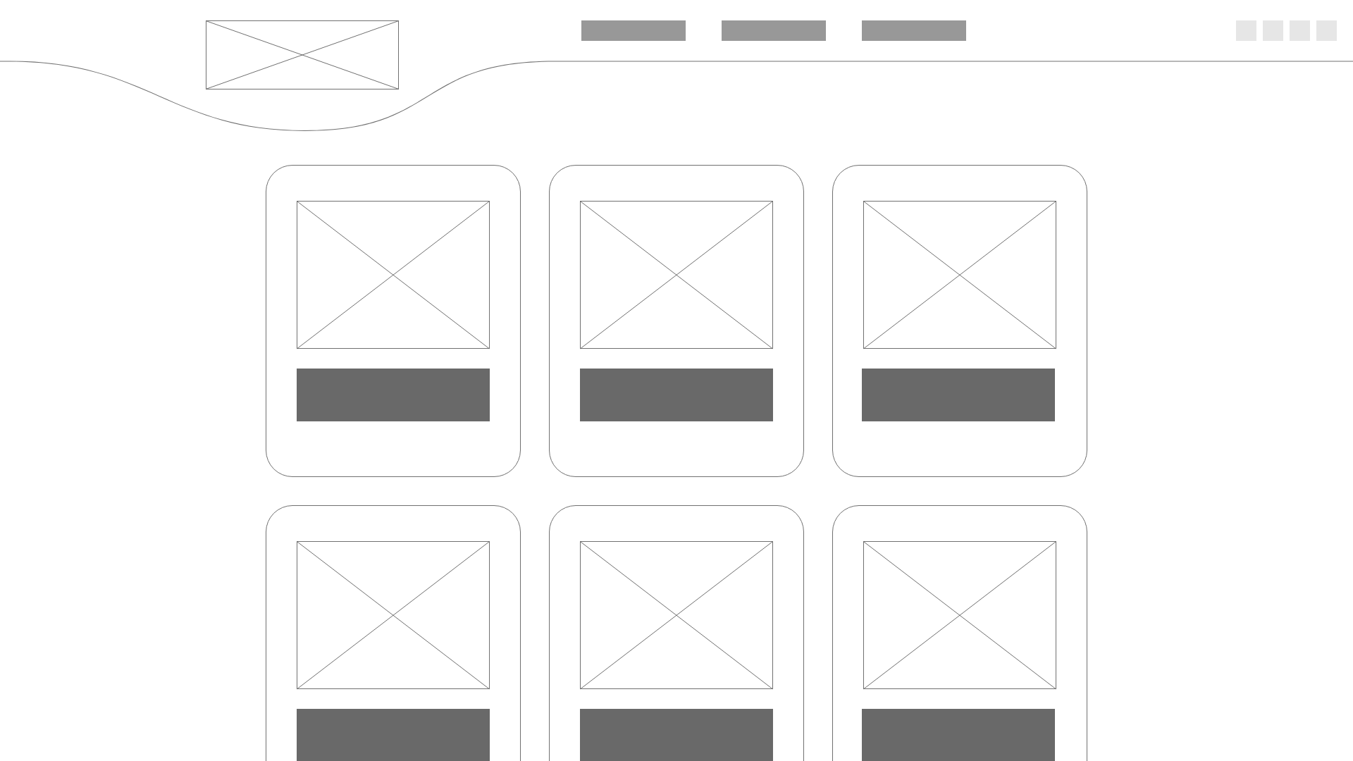
The next concept solved both of the previous problems, but created a new one. It was boring. For a company that was all about having fun, it was a grid. There wasn’t anything visually interesting about it.
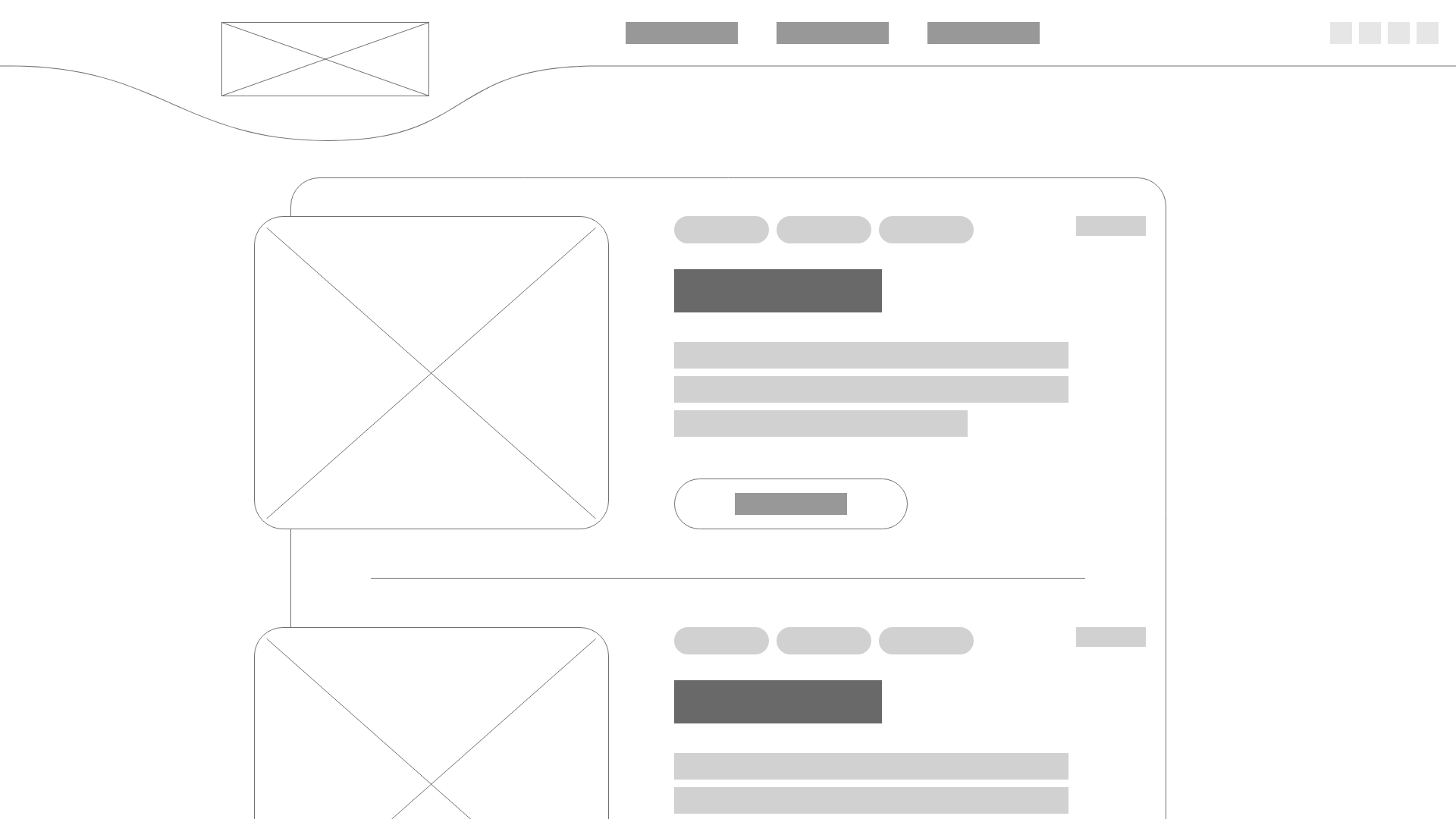
The last concept brought back the fun aesthetic while still avoiding the logistical pitfalls from the first version. It broke the norm by pushing the featured image from each post out of the containing box. It kept to the brand aesthetic with heavily rounded corners. Tags added in at the top also meant the blog could better serve its purpose to establish credibility – easy to learn more about each subject.
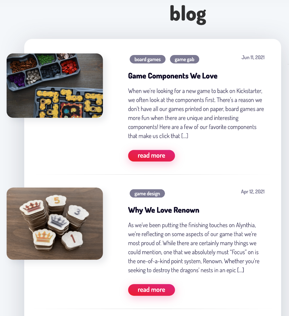
Or so I thought.
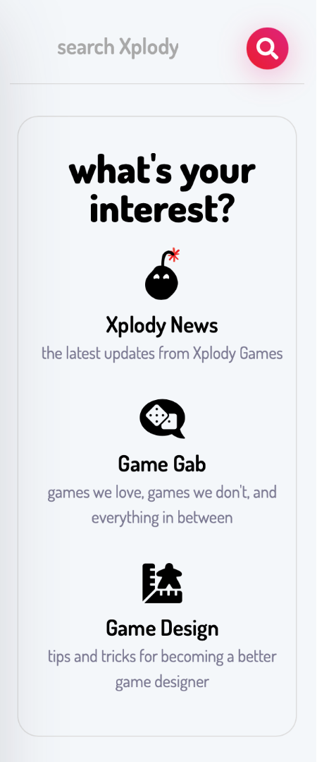
It turns out I grossly underestimated readers’ specific interests. Depending on the reader, they might be reading for updates about a specific game. Or they wanted tips on how to make their own games. Or they were following the company, just along for the ride.
This led to the creation of a sidebar filter and blog search field which did a great job of solving the problem. Users can choose their path with a single click.

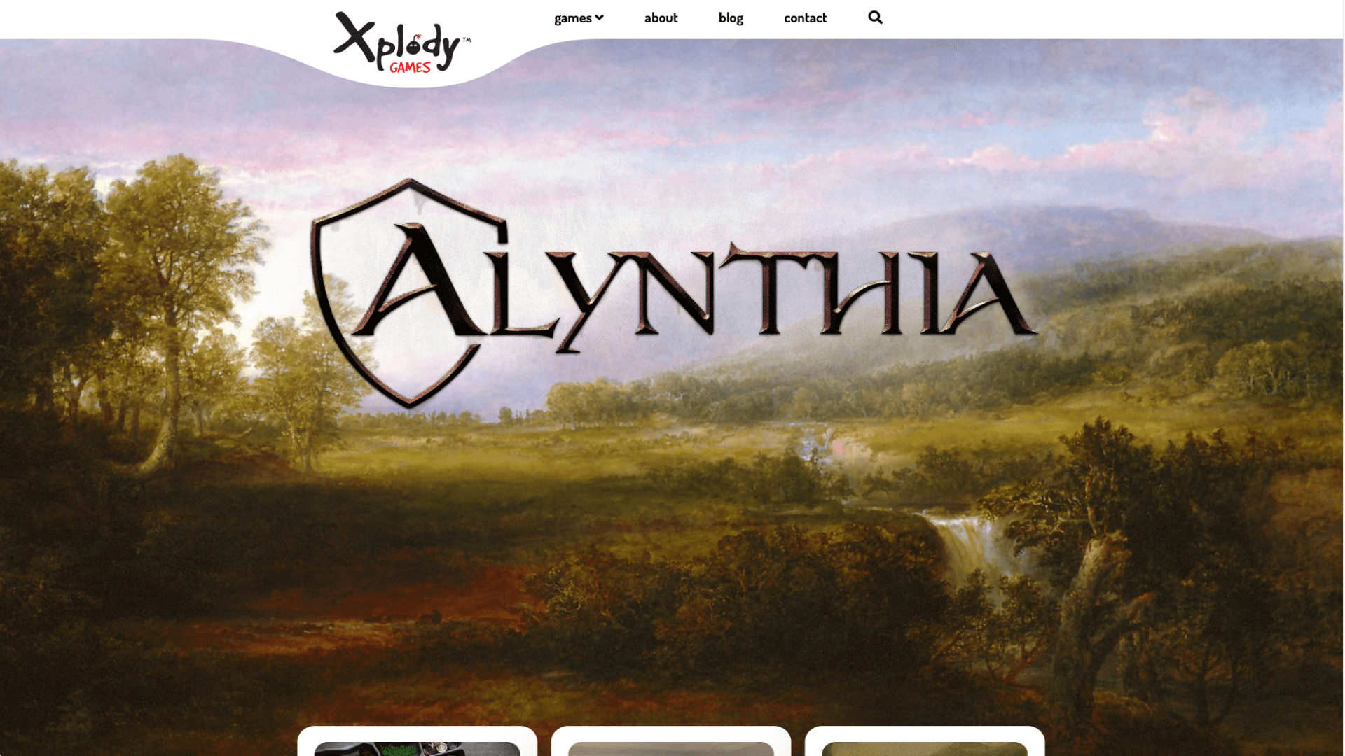
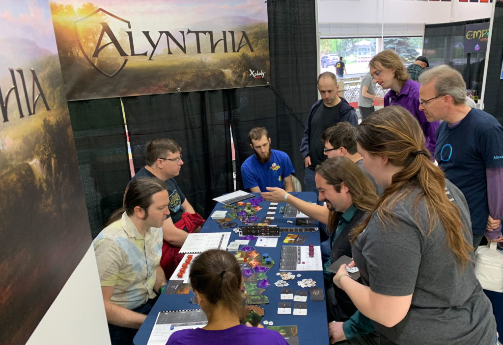
Alynthia
The boardgame that started it all.
Developing a board game can be more involved than creating a brand – because that’s exactly what you’re doing on top of actually making a fun, playable game.
A retail or SaaS company might have their product branded exactly the same as their business. But for a board game, you need to create a world for the user to immerse themselves in. This thematic branding carries through across everything – the game, its marketing, its web page.
Game Branding
I just finished telling you all about research and personas that went into creating Xplody Games. I continued that research looking at Alynthia and its peers. What games was it like? How did it differ? These led to a lot of important decisions about the game’s complexity and style.
“I just like it because it has dragons.”
You’d be surprised how often I’ve heard that. If that’s the hook that pulls them in, I’m all for it. But for some reason, it took a long time to make the connection that the game’s art didn’t reflect that!
Booth branding? No dragons.

Game about fighting dragons? No dragons on the box.
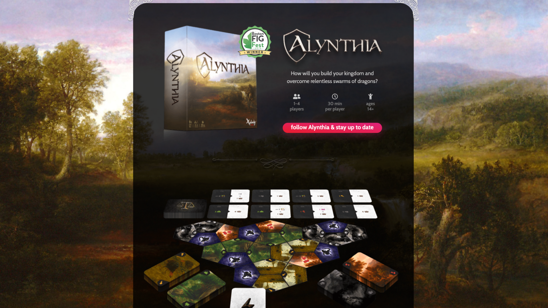
Web page branding? Still not much in the way of dragons.
The process of switching over from non-dragon branding to the fire-breathing monsters we all know and love is ongoing, but the results so far have been very promising. Sometimes it just takes stepping back and then leaning into the areas that are working to make a big impact.
The new rulebook is very dragon-y.

The new box art shows the theme and goal of the game much more clearly.
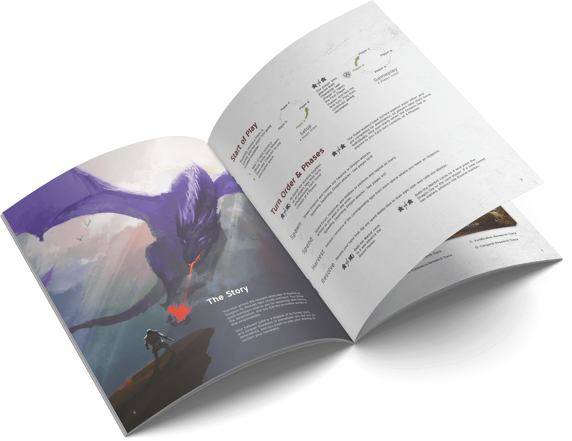
Game UI
One of the most interesting aspects of boardgame creation (to me, at least) is the development of what I call ‘analog user interfaces’. The gaming industry calls them player boards. They’re the chipboard that goes in front of you and tells you what you can do, how you can do it, and how to keep track of it. And there’s a lot that goes into this.
When working with a physical medium, you have very limited space. Information density is highly important – but you can’t sacrifice the experience. Branding, clarity, and intuition are vital to an enjoyable game.
I developed a case study that centers completely around just one player board. There’s easily that much to think through! Want to hear about it? get in touch
Results
An award-winning game with a growing fanbase.
Best Hobby Game – to be clear, that means this game beat out hundreds of submissions and another 50 or so in-person at the convention showcase – to win the category set for the hobbyists. You might know them as ‘The Elite’ from earlier. Paid judges with expert knowledge in the industry have affirmed I hit the target market I wanted to, and did it well.
But to me, the real results are always going back to what the users ahem, players had to say about it. So I’ll leave you with a handful of recent quotes from people who have recently played Alynthia at various conventions it’s been shown at.
“I love this game. Very impressive. Very sharp.”
“Fantastic game!”
“I want to get this.”
“I can’t wait for this to come out!”
“When are you guys going to publish this?”
“It looks really cool. It looks elegant.”
“It’s a ton of fun, but still challenging.”
“I love a game like Alynthia where you walk away and ask what if I did Y on turn X. This leads to really wanting to come back to the table and try other strategies.”
“Where can I sign up to get updates?”
“My gaming group would have so much fun with this.”
Have some fun!

Get hungry.
Creating a one-stop meal-prep portal
Overview
When you’re a DIYer, know how to build websites, and can’t find the ideal meal planning, prep, and shopping tool for your family, this is the result. I created a portal to store and share our recipes with an easy way for my wife to add and update content. This evolved into a full-feature web app with three distinct sections: Recipes, Meal Calendar, and Shopping Lists.
Challenge
Creating an interconnected web app that ‘just works’ is no easy task. It needs to look good, be intuitive, have a slew of features, and, as it became more popular with friends and family, support multiple users.
My role
Husband of the client
- Web design
- Web development
- UX/UI design
Research
The current state of recipe websites.
Whenever I’m presented with a task, the first thing I like to do is look for similar offerings in the wild. Is there something that has something similar to functionality I need? Has a design challenge been solved already? I researched top recipe websites to see what they’ve been doing. I found some glaring issues.
It’s often hard to modify, store, and share recipes.
The workflow I kept hearing from various home cooks was:
- Find a recipe on one of the major food sites.
- Pin that page to Pinterest.
- Plan when to have that meal.
- Create a shopping list from the recipe’s ingredients.
- Go shopping, get everything needed, wait for the start of meal prep.
- Find that recipe in Pinterest, open it, scroll to the actual recipe, and start the actual meal prep.
- Scroll up to the ingredients, scroll down to the step, switch apps to the unit converter, switch apps to the timer, …
Almost every step in the process requires a different tool. Nothing is truly connected to work together.
Recipes aren’t interactive.
Do you end up using your phone as a timer, unit converter, and web browser? Current recipe sites don’t incorporate features that make this process less frustrating. The result is losing your place in a list and having to read through it again.
Here’s my life story.
Almost all recipe websites start with a story about the author’s experiences with the dish. I believe the purpose is twofold: to connect the recipe to an emotion (to make it more memorable) and to increase search engine ranking. The latter is understandable. The former almost always fails. Users want to get to the ingredients and the instructions without having to scroll halfway down the page.
Define
Home cooked meals made easier.
The target audience and personas seemed pretty obvious to me, but I still wanted to go through the process and do things right.
The busy home cook.
Meal prep takes time. In a busy household, the chef of the family shouldn’t need to search for the right tools or do the manual process of transferring items between separate tools.
The persona is based on my wife: A millennial, working mother of two. She wants something easy to use – something that makes her life easier. She enjoys trying and sharing new recipes, but not when it adds too much extra time to her already busy lifestyle.
Ideate/Test
Wireframes, failures, iterations, and designs.
Recipes
I realized pretty quickly that I was building something more for me than for my wife. My first iteration required some basic HTML knowledge in order to update a recipe – of which my wife has none. It was also too bright – more often than not meal planning happens at night. Hello, dark mode!
The first version was admittedly pretty bare bones.
From there I realized I had planned to make things too ‘showy’. I had massive image blocks and a low density of information without an intuitive search method.
I also knew that while information density is important, so is an appetizing picture. ‘You eat with your eyes first.’ I went through multiple design iterations to find a balance of information density, attractive content, and intuitive UI.


I found the most intuitive way to create and update content was to do as much of the work in-line as possible. So the interface for recipe creating/editing looks very similar to the way the final recipe will look.

You see what the recipe will look like as you go.
When the recipe is created, it automatically wraps each new line into a new list item, so it’s easy to copy and paste from other sources. I also used this feature to create the ability to check off ingredients and steps as you go – No more losing your place!

The final result.
Meal planning
Okay, the recipes have been added. Now what?
You can search for recipes on the main list with live updating as you type. But that doesn’t help if you want to create a calendar. My family plans our meals two weeks at a time. This cuts down on shopping and helps to reduce the decision paralysis of ‘what are we having for dinner?’.
So I did just that – I created a calendar that autogenerates two weeks forwards. I pulled the recipe list into a frame next to the calendar and made a drag and drop interface to easily plan meals. I also added the ability to create ‘fake’ recipes – things not in the recipe list – and add a URL to link to an outside source if needed. We often use this for ‘getting dinner out’ or trying a new recipe before deciding if we should add it to the main list.

The wireframe

The mockup
My wife was thrilled with the calendar’s capabilities, but she asked for a meal history going back two weeks as well. She wanted to see what we’d recently had to avoid too much repetition.

Shopping List
There are tons of shopping list apps out there. I knew mine would only be useful if it was directly integrated with everything else. I achieved this by pulling information directly from the calendar and recipe list. When the user adds a recipe to their meal calendar, the recipe is accessed, its ingredients are copied, and an ‘upcoming recipes’ section is added to the shopping list with those ingredients. The user can then check that list against their pantry and modify it as needed by either deleting items or adding them to individual stores’ lists.

The first version sorted everything by stores, but it wasn’t clear how to add new items.

The next version started with an expanded store to show the items and a button to add new items.

It was still pretty clunky.

Then I tried grouping similar UI content together – filters and stores at the top, items at the bottom.

It was intuitive to use, but it still took too much screen space. Mobile use required a lot of scrolling.

The current version hides most controls in a menu to the side (or to the top if you’re on mobile).

And of course I included various sorting and content options. New items can be created. Items include a name, quantity, brand, store, and section/department. These are then sorted by status, store, and then section, alphabetically.

Based on feedback, I added two more features. First, I added a way to bulk delete items from a store list that had already been added to the cart (purchased). Second, I added a new status: save for later. This allowed us to see at a glance that we’re running low on an item, but we don’t need it right away – very useful when waiting for sales.
Results
A work in progress that keeps evolving.
This is a hobby project that I keep building on. It’s definitely got some rough edges, and it has an even bigger roadmap (What project doesn’t?), but it serves its purpose. So well, in fact, that I keep getting asked to give other people their own account on it. I’m excited to see it continue to grow!
Get to cookin’
See the live site!If you would like to see the user-specific sections, please message me.

Live clean.
Transforming the laundry experience
Overview
Laundry has transformed from primarily organic fibers like cotton and wool to synthetics and synthetic blends – things like polyester, spandex, nylon, and much more.
Challenge
Creating a disruptive product, brand, and messaging in a laundry market that’s fully saturated with major, massive corporations dominating the playing field.
My role
Chief Creative Officer
- Brand design
- Product design
- UX/UI design
- Promotional design
Research
Multiple focus groups, surveys, and customer feedback revealed important takeaways.

It turns out that users don’t know what ‘clean’ really is. Thanks to decades of misleading marketing, they’ve been led to believe a pleasant fragrance means their clothes are clean. But that fragrance just hides the smell and the bacteria still trapped in the fabric.
Fitness is trendy.
Fitbit, Apple Watch, workout lists, yoga (and its many variations), the rise and fall of exercise regimens… All of these focus on wellbeing and fitness, and they’ve become major influences on culture and style.

People love their activewear.
From leggings and yoga pants to thermal and moisture-wicking fabrics, consumers are enamored with the trend of comfortable, fashionable, ‘hi-tech’ clothing. The category is projected to be worth 157 billion USD by 2024. These synthetic fabrics are lightweight, flexible, and often expensive.

Laundry has a dirty secret.
Misinformation has taught users that the problem is with them. They put on activewear and only minutes later, it starts to stink. The reason? Traditional laundry detergent only masked the stink with a fragrance. When the fragrance wears off, the stink comes back.
Define
Get your gear in shape.

One of our cofounders was a professional athlete. This gave us a unique origin story:
He knows what it means to sweat.
He noticed that his apparel and tech gear would still stink, even after they had been washed. He searched for a solution and partnered with scientists in the cleaning industry to come at the problem from a different angle. And that’s where HEX Performance was born.
Instead of relying on old methods to clean new fabrics, HEX started from scratch to develop the best clean for today’s active wear.  The result is an evolved science that works on all fabrics, delivers a better cleaning experience, proactively protects fabrics against future stink and stains, and offers a host of extra benefits. It could be the biggest breakthrough in laundry cleaning in decades.
Ideate/Test
Years of design iteration, evolution, and improvement.
We developed marketing campaigns, a full e-commerce website (and multiple major overhauls), B2C & B2B pitches, packaging designs and redesigns over the years – always going after consumer and retailer wants and needs. Through this process, we learned something very important.

(Re)Define
Everybody sweats. Everybody does laundry.
This isn’t a sports detergent. This is a detergent meant for everyone – for humans who sweat. We pivoted our design style to appeal to a much wider market and developed a persona to match the people with household shopping power:
Sarah is a busy mom.
Sarah is an affluent millennial with an active household. Her kids play sports, she does yoga with her friends, and her spouse goes to the gym. She loves activewear, and she shops at stores like Target and Wegmans. She doesn’t have time to wash and rewash her family’s laundry if it doesn’t come out clean the first time.
